

Damn, GL - slapping Russians around with a giant bear ... that's kind of an ironic bitch-slap, isn't it?
I've mentioned before how Green Lantern has always been a front-runner on my top-heroes list, and this panel from Green Lantern #15 sums up why. When I say "Green Lantern" I'm talking about Hal Jordan, and in the classic Silver and Bronze Age interpretations you could always count on some visually wacky action to go along with Hal's charming brand of dickery. Seriously, using the most powerful weapon in the universe to bop someone with a glowing mallet? That's just rubbing it in.
In the newish run written by Geoff Johns and pencilled by Ivan Reis, that version of Green Lantern has been updated while rediscovering all the things that gave Hal his personality - hard-headedness, bravery, nobility, a rakishness that implied he was considering stealing your girlfriend after he was done handing you your ass. Basically, what a normal person might act like if they fell into their own super-powers. Say what you will about Johns and what he's done with the DC universe lately, but he understands characters and is able to elevate and humanize them all at once.
It doesn't hurt that Reis' art is gorgeous, following in the style of Rags Morales and Patrick Gleason. It's perfect for the blend of spandex and science fiction that a Green Lantern title should be; kinetic and detailed without being busy or distracting. And I don't usually mention it, but the inking by Oclair Albert and coloring by Moose Baumann is top-notch, enhancing the whole thing.
But seriously, what's Hal gonna do next - box Australians with a giant kangaroo? Wait a minute ... I think he already might've ...
Green Lantern #15: Geoff Johns, writer; Ivan Reis, artist; Oclair Albert, inker; Moose Baumann, colorist
Friday, December 1, 2006
Favorite Panel Friday says nyet!

Friday, November 17, 2006
Favorite Panel Friday goes for two

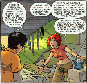
The Escapists #5 is ... well, it's a toughie. To be honest, I've been putting off bringing up this mini-series, even though it's been on the FPF short-list almost every week it's come out. But it can no longer be denied, so feast your eyes on the first-ever two-panel FPF Panelpalooza! Grab your ass with both hands, kids - this is history!
Urm. Yeah, so two wildly different art styles are used to tell two very different - but parallel - stories in this six-parter. One of those stories takes place as a superhero comic, the other as the story of the people creating that comic. Both of them, strangely enough, feature people in costume.
It's all very meta. It's also, at heart, a love letter. Michael Chabon's Pulitzer-winning novel "The Amazing Adventures of Kavalier & Clay" has managed to spin off a series of comic anthologies by various contributors, but The Escapists is the one that lays out the comic-love in all it's geeky glory.
Brian K. Vaughn (man, that dude really IS everywhere!) nicely balances glimpses of the latest story of The Escapist with the mostly mundane story of the three friends producing that story, which is where Vaughn's pitter-pat beats loudest. The superhero story is fun, but it's the everyday lives playing out in Cleveland that you end up caring about most. What the hell was Max thinking? Was that the last straw for Case? Is Denny going to be OK? Are they going to be able to get the next issue out?!?
In a neat twist - who knows if it was on purpose or not - the more sketchily realistic art by Jason Shawn Alexander is used to tell the superhero story while Steve Rolston's rounded-edge, cartoony style depicts the story playing out in the real world. In the comic. I'm not trying to be confusing. Honest.
But look at Alexander's depiction of The Saboteur - man, he just oozes evil! And look at the detail in Case's room; that one panel by Rolston tells you a ton about the character with simple attention to background. Both artists' work sets just the right tone for their respective stories, and dovetail into each seamlessly until they reflect and amplify each other in a way that adds depth to both. It's a pretty slick trick, and one that could easily fall apart if you weren't careful.
But, with one issue left to go, it seems pretty clear that Vaughn, Rolston and Alexander are keeping a protective arm around The Escapists. When you love something, after all, it's only natural.
The Escapists #5: Brian K. Vaughn, writer; Steve Rolston, artist; Jason Shawn Alexander, artist
Friday, November 10, 2006
Damn you, Favorite Panel Friday!
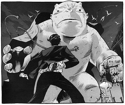
Looking at this panel, you know things aren't going to turn out well for somebody. But take a closer look at it, and you'll see the energy and details that make The Damned such a great fusion of spookhouse horror and gritty crime noir.
Besides the obvious menace of one big, friggin' demon, the Prohibition-era atmosphere is thick in this shot from The Damned #2. Look at the way our little anti-hero Eddie is already reaching for his gun. Look at the crates and warehouses and scattering sea gulls that remind the reader they're at the docks, and that THE DOCKS ARE NOT A GOOD PLACE TO BE.
The Damned is laced with an undercurrent of menace, whether it's a scene involving mobsters from hell or a rough kiss delivered with one arm twisted behind your back, and it all makes for a hell of a fun read. I've also been a fan of Brian Hurtt for a while now, so it's nice to see him making a reappearance so soon after Hard Time got the unwarranted ax (check out his excellent work on Queen & Country, too). Hopefully, this collaboration with author Cullen Bunn will just be the first of several mini-series for The Damned.
The Damned #2: Cullen Bunn, script/story; Brian Hurtt, art/story
Friday, November 3, 2006
Favorite Panel Friday: A well-oiled machine
When Ex Machina first came out a couple of years ago, I'd tell anyone who'd listen (and anyone I could pin to the ground and force to listen) that it was one of the best comics out there. I even said more than once that it was the best new comic of that year.
Two years later, and it's still pretty damn good.
Explaining Ex Machina is a little tricky, but basically it's this: In a world without superheroes, a civil engineer with socialist leanings gains the ability to communicate with machines after a mysterious device he's investigating blows up in his face. With the help of a couple of friends and some gadgets of his own invention, Mitchell Hundred becomes the Great Machine, a superhero who manages to keep the second tower of the World Trade Center from being hit on Sept. 11. Shortly after, Hundred goes public, gives up his role as the Great Machine and is elected mayor of New York City.
Whew! Believe it or not, that's just the back story. Ex Machina tells the story of Mayor Hundred, and while the story lines refer or are impacted by the Great Machine's past exploits, the series is as much a political drama as it is a heroic thriller, if not more. You'd think this would be dull as dirt, but often the ins and outs of the mayor's office is what keeps everything chugging along.
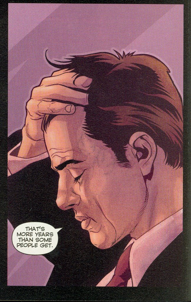
And poor Mitch - he's been through a lot, and it's starting to show. Brian K. Vaughn is everywhere, but this is his tightest work - if I had to guess, I'd say this title is his baby. And artist Tony Harris has thankfully been with it since the beginning, giving Ex Machina a distinct feel and a life of it's own. Sure, the people tend to look suspiciously alike sometimes (especially the women), but not to the point of the aggravating Dillon or Quitely. You can almost start to believe these people exist out there, tromping around New York and trying to get about the business of living their lives.
Who hasn't felt that weariness, the kind that makes you close your eyes and push your hair back, wishing for just a quiet second of peace? That single panel says a lot - about the character, about the situation and about the creators' understanding of their readers.
It may not be the best comic of the year, but it's still pretty damn good.
Ex Machina #24: Writer, Brian K. Vaughn; Artist, Tony Harris
Friday, October 20, 2006
Favorite Panel Friday was raised by an Admiral solid-state television
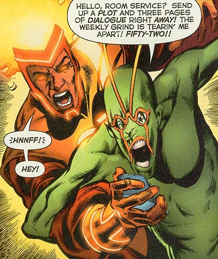
Some good stuff came out this week, and I know the latest issue of 52 is probably just some more of Keith Giffen trotting out his favorite whacked-out creations, but today's panel is all about two words: Ambush Bug.
AMBUSH! BUG!!!
52 #24: Writers, Geoff Johns, Grant Morrison, Greg Rucka, Mark Waid; Artist, Phil Jimenez
Friday, October 13, 2006
Favorite Panel Friday drops anchor

As mentioned in a previous post, the panel picked for FPF isn't necessarily from my favorite comic of the week - which is the case with The Pirates of Coney Island #1. But it was a comic that sure stuck with me, rolling around in my head and poking me in the brain until I read it again.
A big part of that is the art. Strong, fluid, indie-style drawing just jumps off the page thanks to a thick inking job and a color pallette that's bold without being distracting. This is a book that actually seems to have honest-to-God art direction, and the almost garish coloring enhances the action and mood of any given panel.
There's a definite old-school vibe going on here; check out the classic dot-screen used for shading. Bits of the 70s, 80s and 90s are mish-mashed with a Britcomic aesthetic and a sprinkle of American thrift shop; weirdly, it works. The grittily intriguing story about gutter punks and brutal street gangs is solid, and meshes perfectly with the razor-dangerous art.
That's not to say it's all peachy. The Pirates of Coney Island is very hip ... and sometimes feels like it's trying just a little too hard. There's plenty of influence from "street" sources like graffiti and tattoo art, but hitting people over the head with it (especially in the notes from creators Rick Spears and Vasilis Lolos) is a little bit of overkill. You know how when people keep telling you how cool they are, the less you believe it? Sorta like that.
And while the art is great, faces tend to be hard to tell apart sometimes (particularly the women), and there's one character I didn't realize was supposed to be older than the teens until it was mentioned in the dialogue. The work is unique, but don't be surprised if you suddenly find yourself thinking of Tank Girl comics and Gorillaz cover art.
Still, it grabbed me, with a grip strong enough that I had to re-read it, and will probably re-read it again. Let's cross our fingers that this doesn't turn out to be just another book with great art wrapped around a story that goes from good to crappy halfway through (I'm looking at you, Supermarket).
The Pirates of Coney Island #1: Writer/Letterer, Rick Spears; Artist, Vasilis Lolos
Friday, September 29, 2006
Favorite Panel Friday says: Eat Me
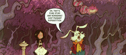
OK, I have to admit it - I have a thing for Alice's Adventures in Wonderland and Through the Looking-Glass. I also have a bone-deep exhaustion for all the freakin' retellings of Lewis Carroll's stories and reimaginings of his iconic characters.
But I pretty much love Wonderland.
Taking place sometime after the now-notorious Alice has fled the scene, Wonderland picks up the thread with Mary Ann, the unseen girl the White Rabbit confused Alice for in Adventures. Compulsively committed to her housemaid duties, Mary Ann is only slightly less whacky than more familiar characters - like the Rabbit and the Cheshire Cat - also making an appearance.
At first, I was a little leery of the connection with Disney (the cover blurb says it's, "Inspired by Lewis Carroll's classic works and the Disney animated motion picture"), but the Mouse's influence seems to be mostly cosmetic. Thankfully, the story and dialogue have a healthy streak of Carroll in 'em, making it a fun read from writer Tommy Kovac.
And the art is great - what, are you kidding me? Look at that panel; see how the Cheshire Cat looks a little mottled? It's not sunlight, it's the BACKGROUND! Artist Sonny Liew has designed the Cat so he's always slightly transparent (and the creepy sucker never stops smiling, either). The art work could easily be taken from a children's book, but luckily this blend of classic illustration with a watercolor feel (and a pinch of manga expressionism) is coming out on a monthly basis.
This is a comic I don't think I'll be getting tired of anytime soon.
And the Jabberwocky is awesome.
Wonderland #2: Writer, Tommy Kovac; Artist, Sonny Liew
Friday, September 22, 2006
Favorite Panel Friday is fashionably late
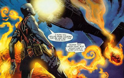
A super hero, some secret-agent talk and a SEVERED, FLAMING VAMPIRE HEAD!
That's a whole lot of comic goodness crammed into one panel, that's for sure. Union Jack #1 spins seamlessly out of the current Brubaker and Epting run on Captain America, seamlessly enough that I didn't realize it was a different creative team at first.
But that shouldn't take away from what writer Christios Gage and artist Mike Perkins are doing with this book. Union Jack nicely fits into the world being created over in Captain America, but expands on it and actually cements the concept of super-powered spy-guys. Political without being preachy, steadily built tension and rich, detailed artwork come together for a first issue that makes you eager for the second.
Union Jack #1: Writer, Christios Gage; Artist, Mike Perkins
BONUS PANEL!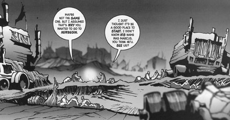
For a "regular feature," the ol' FPF has been pretty irregular lately. Usually, if I'm falling behind in getting a panel up here I'll just shrug and pretend to be busy wrestling bears or writing peace treaties. This time, though, I didn't want to let last week's Wasteland #3 slip by without a mention.
Man, this comic keeps getting better with each issue. The story is a familiar post-apocalyptic-Thunderdome-Dune kind of thing, but it'd be a mistake to dismiss it as unoriginal. There is a definite sense of a larger story, and you can tell a deep history has already been thought out; nothing happens without reason. The art is simple but detailed, and almost stunning in some panels. Restrained use of Photoshop gives the whole thing a cinematic look that really works. Wasteland is an epic in the making.
Get on board with the first issue, free and online!
Wastland #3: Writer, Antony Johnston; Artist, Chris Mitten
Friday, September 1, 2006
Favorite Panel Friday has a plan
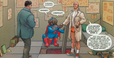
How can you resist a baboon in a Superman suit?!?
Lex Luthor might not be the most evil villain ever, but in All Star Superman #5 he's pretty freakin' villainous. Let's warm up the ol' Comico-Analytron and break it down, shall we?
Warning! SLIGHTLY SPOILERY!
In this panel, Lex has just finished escorting Clark Kent through a raging prison riot to what he assures him is the safety of his cell. Just as they're arriving, Lex makes a crack about how Clark will write something about walking through the cell door, where Lex then "shook hands with a baboon in a Superman suit ..."
Which is exactly what happens! And then he tells Clark how he dug an escape tunnel with a robot reciting Moby Dick. It's good to know Melville's good for something.
OK, the SPOILERS END HERE.
For all the damage Frank Miller has done to the still-stumbling toddler called the All Star line, Grant Morrison redeems it with his writing on All Star Superman. There was a lot of noise about the All Star imprint taking DC back to its Silver Age roots and "making comics fun again," and damn if Morrison doesn't do just that. That doesn't mean it's fluff - Luthor's currently making a pretty serious bid to kill the Man of Steel - but it does mean it's OK to be a little silly, to be a little weird and, yeah, to have some fun.
Morrison's Luthor is classic; arrogant, insane and smart as hell. As a matter of fact, it's the first time I can think of where it's implied that Lex is so smart he had to be crazy. Oh, and this particular issue also has the best explanation I've seen for why Lex hates Superman sooooo much.
One more thing to note is Frank Quitely's art. Now, I'm on the fence about Quitely. I was OK with him on Authority (even though everyone looked like they were on the catwalk), but hated his stuff on New X-Men. Loved We3, was annoyed by JLA: Earth 2. He bugs me for the same reason Steve Dillon bugs me - they draw the same face over and over and over and over. And over. The only difference is Quitely adds the extra bonus of making everyone pouty and lumpy (not a great combination).
But when he's on, he's great. And while that lumpiness creeps in now and then, faces are distinctive and expressive, and his backgrounds continue to kick ass in All-Star Superman.
By taking some cues from the Superman of the Silver Age, Morrison and Quitely are reinventing the Man of Steel for today. They're obviously having fun doing it, and that's making it fun to read.
So let's hear it for Leopold and crazy-ass Lex Luthor.
All Star Superman #5: Writer, Grant Morrison; Artist, Frank Quitely
Friday, August 25, 2006
Favorite Panel Friday goes through a phase
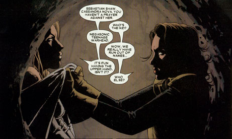
Sometimes it's hard to pick a favorite panel from the weekly stack of comics: This time, it was almost impossible to pick a favorite out of the single issue that is Astonishing X-Men #16.
When I was just a little pastelito, I was a hard-core X-Men fan. Then, like a lot of people, I grew up. The melodrama, the impossibly convoluted plots and the constant hammering of Claremontisms became too much until finally, with a "feh!", I stopped reading any title that started with "X."
For the most part, I've never regretted it. But when Joss Whedon started writing a new Astonishing, I was in. And month after month, along with the outstanding art of John Cassaday and the perfect coloring of Laura Martin, he reminds me of what I used to love about the X-Men. It's funny, it's heartfelt and it's action-packed. Whedon is a great writer with a talent for dialogue. Even better, he understands what makes these characters great, and you can tell he cares about them as much as we do. He's updated them without ruining them, making changes feel organic instead of like a gimmick.
And you can tell that Whedon - like the rest of us - always had a crush on Kitty.
Astonishing X-Men #16: Writer, Joss Whedon; Artist, John Cassaday; Colorist, Laura Martin
Friday, August 18, 2006
Bride of Favorite Panel Friday
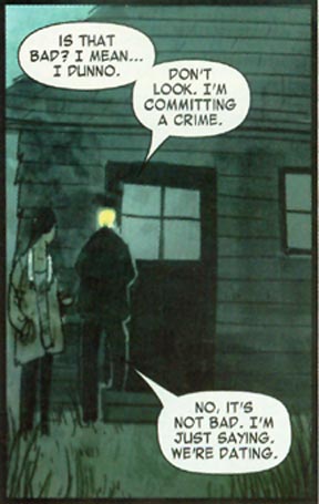
I love Fell. I love everything about it; it's consistently some of Warren Ellis' best writing, and Ben Templesmith has one of the most unique and distinctive illustrative styles in comics today. I like that every compact issue is a self-contained story, but is also another chapter in a vaguely creepy, overarching storyline.
Fell, will you marry me? You and Lopez! can work out the schedule.
OK, let's put this in perspective: Ellis has written some of my favorite books, like The Authority, Transmetropolitan and, most recently, Desolation Jones. He is, as the kids say, the shit (do the kids still say that?).
And Templesmith combines traditional drawing and painting styles with Adobe-fueled technology to create work that looks simplistic at first but drips depth and atmosphere. He practically reinvented vampires with 30 Days of Night, and his current Wormwood: Gentleman Corpse should already be on your pull list.
All this is a long-winded way of saying the panel from Fell #6 above is a nice example of snappy dialogue and moody scene-setting, a combination of casual patter and building tension in a book that manages to be crime-noir, horror and love-letter to the fictional Snowtown all at once. With this panel, you're rooting for Rich Fell, in every sense.
Special bonus! Hey, the first issue of Fell is available – for free, you deadbeats – online. Check it out, why don'cha?
And man, what's with that Nixon-nun?!?
Fell #6: Writer, Warren Ellis; Art, Ben Templesmith
Friday, August 11, 2006
Favorite Panel Friday, the Destroyer
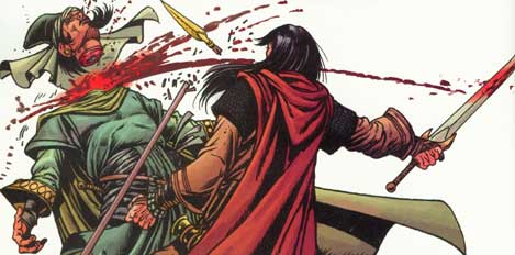
And THAT'S why, when Conan tells you he's joining your caravan, you don't try to shake him down for money.
Here's a handy rule-of-thumb to remember: Conan doesn't negotiate. He's Conan! He doesn't have time for your coy wordplay. He barely has time to kick your free-range melon out of the way.
Speaking of wordplay, I've been enjoying Joe R. Lansdale's scripting on Conan and the Songs of the Dead, a five-part mini-series which carries on the regular title's love of beheadings with this lopping from issue #2. I especially like the shot of humor he's given Conan (even if the dialogue sounds a little too much like something out of a Hap and Leonard scene sometimes), and it's always nice to see Lansdale's words coming out of art drawn by Timothy Truman. Remember how creepy their Jonah Hex stories were? Throw a battle ax and some people speaking "medieval" in there, and you've got an idea of what's going on in Songs of the Dead.
Oh, and don't forget - Conan was captain of the debate team for a reason.
Conan and the Songs of the Dead #2: Writer, Joe R. Lansdale; Art, Timothy Truman


 Posts
Posts


